
Mapping the World's Hazards
A geospatial portrait of where global disasters strike, mapping 50 years of events by type and place to reveal how risk follows the planet's fault lines, river deltas, and storm tracks.
Charts & blocks
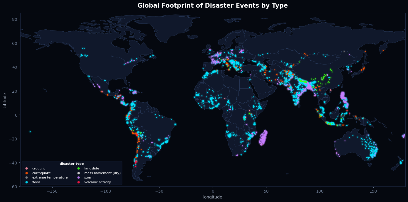
Each point is a recorded disaster from the GDIS dataset, placed at its coordinates and colored by type. It's a portrait of where environmental hazards concentrate worldwide.
Familiar risk patterns emerge clearly. Floods (cyan) dominate South and Southeast Asia, with India, Bangladesh, and the Philippines forming a dense core shaped by monsoons, river deltas, and high population exposure. Storms (violet) follow the tropical cyclone basins - the Bay of Bengal, South China Sea, and Caribbean. Earthquakes and volcanic activity (orange and red) trace the tectonic boundaries, lighting up the Pacific "Ring of Fire" and the Andes.
Summary
No short summary yet.
The global distribution of disaster events is anything but random. Plotted at their coordinates, the events resolve into the shape of the continents and into the planet's well-known zones of hazard. The geography of risk is written directly into the data.
Floods form a dense core across South and Southeast Asia, where monsoons, river deltas, and exposed populations turn heavy rainfall into recorded disaster. Storms follow the same coastal logic, clustering along tropical cyclone basins like the Bay of Bengal and the Caribbean. Earthquakes and volcanic activity trace something deeper: the boundaries between tectonic plates, lighting up the Pacific "Ring of Fire" and the Andes where the Earth's crust is most active.
The map also validates itself. The continents are legible from the points alone, with no basemap required, confirming that the dataset's coordinates are accurate. Errors would have scattered points into the oceans or collapsed them onto the origin, and none did.
One caveat remains: the map shows recorded events, and recording is uneven. Coverage is denser in recent decades and in better-monitored countries, so some apparent concentration reflects documentation as much as true hazard frequency. Read that way, the map is a portrait of where hazards concentrate and where they have been most thoroughly observed.
Findings in detail
Disasters follow the planet's fault lines and storm tracks
Events cluster sharply along tectonic boundaries and tropical cyclone basins rather than spreading evenly. The Pacific "Ring of Fire," the Andes, and the Bay of Bengal light up exactly as physical geography predicts, confirming that disaster risk is driven by where hazards form, not by chance.
Geocoding accuracy, confirmed visually
The continents are recognizable from disaster points alone, with no basemap underneath. This is a built-in data-quality check: accurate latitude/longitude reproduce the world's outline, while coordinate errors would scatter points into the oceans or pile them at 0°,0°. The map passes.
Records reflect reporting, not just reality
Event counts are shaped by how thoroughly each region and era documented disasters. Denser coverage in recent decades and in well-monitored countries reflects improved reporting as much as true hazard frequency, a reminder to read the map as a record of what was captured, not a complete census of every event.
Methodology
Data source. This analysis uses the GDIS (Geocoded Disasters) dataset, which records individual disaster events worldwide with their location, date, disaster type, and geographic coordinates. The working dataset was a sample of the full GDIS records, accessed through the Panthaion platform and analyzed in Python.
Preparation. Latitude, longitude, and year fields were converted to numeric types, and records missing valid coordinates were excluded from the spatial analysis. Disaster type was retained as a categorical field for grouping and color-coding. No coordinate transformations were applied; events were plotted on an equirectangular projection using raw longitude and latitude values, which preserves the underlying data without reprojection artifacts.
Visualization. Each event was plotted as a point at its recorded coordinates and colored by disaster type. To convey event density in heavily affected regions, each point was drawn in two layers: a large, highly transparent "glow" beneath a smaller, brighter core. This causes overlapping events to accumulate visually, so that concentrations such as South Asian floods or Pacific seismic activity appear as luminous clusters rather than indistinguishable masses. Country outlines were added as a reference basemap, drawn from public Natural Earth boundary data and rendered beneath the event layer.
Validation. Because the dataset's accuracy could not be assumed, geocoding quality was assessed visually: if coordinates are correct, the distribution of points should reproduce the outline of the continents without any basemap. The points did so, providing a qualitative confirmation that the latitude and longitude fields are sound. Coordinate errors would have manifested as points scattered into oceans or clustered at the 0°,0° origin, neither of which was observed.
Limitations. Event counts reflect what was recorded rather than every disaster that occurred. Reporting completeness varies across regions and over time, with denser coverage in recent decades and in countries with stronger monitoring infrastructure. As a result, the map should be interpreted as a record of documented events, shaped partly by reporting practices, rather than a complete census of global disaster activity. Additionally, findings are based on a sample of the full dataset and may not capture the complete geographic or temporal distribution of the underlying records.
Datasets used
Papers
No public papers listed.
Datasets
138,432 records · 1.6 MB
763 records · 46.1 KB
5,824 records · 187.8 KB
212,347,650 records · 166.9 MB
1 records · 4.1 KB
488,999 records · 821.4 KB
39,953 records · 1.1 MB
1 records · 3.1 KB
Notebooks
This notebook is listed on the public showcase. Sign in as a project member to open it in the workspace.
Provenance
Attached full marketplace file via DuckDB: "GDIS (Geocoded Disasters, 1960–2018) (DOI 10.7927/zz3b-8y61) - Lookup Table" (v1).
No extra payload on this event.
Attached full marketplace file via DuckDB: "GDIS (Geocoded Disasters, 1960–2018) (DOI 10.7927/zz3b-8y61)" (v1).
No extra payload on this event.
Attached full marketplace file via DuckDB: "GDIS (Geocoded Disasters, 1960–2018) (DOI 10.7927/zz3b-8y61) - Metadata" (v1).
No extra payload on this event.
Notebook cell executed.
Renamed project to "Mapping the World's Hazards".
No extra payload on this event.
Saved notebook to project: "Analyze with Python — GDIS (Geocoded Disasters, 1960–2018) (DOI 10.7927/zz3b-8y61) - Metadata - Panthaion".
No extra payload on this event.
Notebook cell executed.
Notebook cell executed.
Notebook cell executed.
Notebook cell executed.
Notebook cell executed.
Notebook cell executed.
Notebook cell executed.
Notebook cell executed.
Notebook cell executed.
Notebook cell executed.
Notebook cell executed.
Notebook cell executed.
Notebook cell executed.
Notebook cell executed.
Notebook cell executed.
Attached full marketplace file via DuckDB: "Avian Influenza active surveillance lab results (2006–2011) (DOI 10.5066/P96YJRWR) - Metadata" (v1).
No extra payload on this event.
Notebook cell executed.
Notebook cell executed.
Notebook cell executed.
Notebook cell executed.
Notebook cell executed.
Notebook cell executed.
Notebook cell executed.
Notebook cell executed.
Notebook cell executed.
Notebook cell executed.
Notebook cell executed.
Notebook cell executed.
Notebook cell executed.
Notebook cell executed.
Notebook cell executed.
Notebook cell executed.
Notebook cell executed.
Notebook cell executed.
Notebook cell executed.
Notebook cell executed.
Notebook cell executed.
Notebook cell executed.
Notebook cell executed.
Notebook cell executed.
Attached full marketplace file via DuckDB: "BBS - North American Breeding Bird Survey - Weather" (v1).
No extra payload on this event.
Attached full marketplace file via DuckDB: "BBS - North American Breeding Bird Survey - Species" (v1).
No extra payload on this event.
Attached full marketplace file via DuckDB: "BBS - North American Breeding Bird Survey - Routes" (v1).
No extra payload on this event.
Attached full marketplace file via DuckDB: "BBS - North American Breeding Bird Survey - Routes" (v1).
No extra payload on this event.
Attached full marketplace file via DuckDB: "BBS - North American Breeding Bird Survey" (v1).
No extra payload on this event.
Attached full marketplace file via DuckDB: "NOAA earthquake intensity database" (v1).
No extra payload on this event.
Attached full marketplace file via DuckDB: "Avian Influenza active surveillance lab results (2006–2011) (DOI 10.5066/P96YJRWR) - Metadata" (v1).
No extra payload on this event.
Attached full marketplace file via DuckDB: "GDIS (Geocoded Disasters, 1960–2018) (DOI 10.7927/zz3b-8y61) - Lookup Table" (v1).
No extra payload on this event.
Attached full marketplace file via DuckDB: "GDIS (Geocoded Disasters, 1960–2018) (DOI 10.7927/zz3b-8y61)" (v1).
No extra payload on this event.
Attached full marketplace file via DuckDB: "GDIS (Geocoded Disasters, 1960–2018) (DOI 10.7927/zz3b-8y61) - Metadata" (v1).
No extra payload on this event.
Notebook cell executed.
Notebook cell executed.
Notebook cell executed.
Created notebook "Disasters, Diseases, and the Birds That See Them Coming".
No extra payload on this event.
Dataset "BBS - North American Breeding Bird Survey - Weather" (vv1) linked.
No extra payload on this event.
Dataset "BBS - North American Breeding Bird Survey - Species" (vv1) linked.
No extra payload on this event.
Dataset "BBS - North American Breeding Bird Survey - Routes" (vv1) linked.
No extra payload on this event.
Dataset "BBS - North American Breeding Bird Survey" (vv1) linked.
No extra payload on this event.
Dataset "NOAA earthquake intensity database" (vv1) linked.
No extra payload on this event.
Dataset "Avian Influenza active surveillance lab results (2006–2011) (DOI 10.5066/P96YJRWR) - Metadata" (vv1) linked.
No extra payload on this event.
Dataset "GDIS (Geocoded Disasters, 1960–2018) (DOI 10.7927/zz3b-8y61) - Lookup Table" (vv1) linked.
No extra payload on this event.
Dataset "GDIS (Geocoded Disasters, 1960–2018) (DOI 10.7927/zz3b-8y61)" (vv1) linked.
No extra payload on this event.
Dataset "Avian Influenza active surveillance lab results (2006–2011) (DOI 10.5066/P96YJRWR)" removed from project.
No extra payload on this event.
Dataset "Avian Influenza active surveillance lab results (2006–2011) (DOI 10.5066/P96YJRWR)" (vv1) linked.
No extra payload on this event.
Dataset "GDIS (Geocoded Disasters, 1960–2018) (DOI 10.7927/zz3b-8y61) - Metadata" (vv1) linked.
No extra payload on this event.
Empty project created.
No extra payload on this event.
Discussion
Threads workspace members link to this project appear here. Open Forums for the full forum.